
Best Room Color Schemes to Transform Any Space with Style

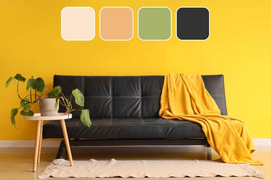
Choosing the right room color schemes can instantly change how your home feels—brighter, calmer, cozier, or more pulled together.
The tricky part is picking colors that look great in your lighting and still work with your furniture. In this guide, you’ll find versatile palette ideas, simple ways to match undertones, and styling tips that make any space feel intentional.
Whether you’re refreshing one room or planning a whole-home update, you’ll leave with color confidence.
How to Choose a Room Color Scheme That Actually Works

A good palette isn’t about chasing trends—it’s about creating a look that fits your space and the mood you want.
Start with these three anchors:
- Lighting: North-facing rooms often feel cooler; south-facing rooms feel warmer and brighter. This changes how paint reads on the wall.
- Fixed finishes: Flooring, countertops, tile, and large upholstery pieces “vote” whether you want them to or not.
- Mood: Calm and airy? Cozy and grounded? Bold and energized? Your goal narrows the palette fast.
Quick rule: Pick one main wall color, one supporting neutral, and one accent (through textiles, art, or small décor). That’s enough to feel styled without feeling busy.
The Easiest Way to Get Undertones Right (So Paint Doesn’t Look “Off”)
Undertones are why beige can look pink, gray can look blue, and “white” can suddenly feel yellow.
Warm vs. Cool: a simple check
- If your room has lots of warm elements (honey oak, brass, cream stone), look for warm whites, greiges, soft earthy colors.
- If your room leans cool (gray tile, chrome, bright white trim), consider crisper whites, cooler grays, blue-greens.
Tip: Hold a pure white sheet of paper next to your paint sample. If the sample looks yellow, it’s warm. If it looks blue/gray, it’s cool. If it looks pink, it’s often a warm neutral pulling rosy.
Best Neutral Room Color Schemes (Timeless, Not Boring)

Neutral doesn’t have to mean flat—texture and contrast do the heavy lifting.
Warm neutral + crisp white + black accents
- Walls: warm greige or creamy beige
- Trim: clean white
- Accents: matte black hardware, frames, lighting
This is a “works anywhere” scheme for living rooms, hallways, and open layouts.
Soft white + natural wood + layered linen tones
- Walls: soft white
- Furniture: light-to-medium wood
- Textiles: oatmeal, sand, stone
Style trick: Add depth with woven textures (baskets, jute, boucle, linen curtains). It reads cozy and elevated, not plain.
Taupe + warm gray + brass
- Walls: taupe or mushroom
- Secondary: warm gray
- Accents: brass and caramel leather
Great for bedrooms or family rooms where you want calm but grounded.
Cozy Color Schemes That Make Rooms Feel Warm and Inviting

If your space feels stark, try palettes with earthy warmth.
Terracotta + warm white + olive
- Walls: warm white
- Accent: terracotta (pillows, art, a painted piece)
- Supporting: olive green
This combo looks especially good with plants, vintage wood, and woven décor.
Clay blush + cream + walnut
- Walls: creamy neutral
- Accent: clay blush
- Anchor: walnut or dark wood
Perfect for bedrooms, nurseries, and anywhere you want soft warmth without going too pink.
Camel + ivory + deep brown
- Walls: ivory
- Textiles: camel throws, tan rugs
- Accents: espresso brown
Instant upgrade: Add contrast with a dark frame gallery wall or deeper-toned side tables.
Fresh Cool-Toned Room Color Schemes (Crisp, Airy, Modern)

Cool palettes can feel clean and open—especially in bright rooms.
Blue-gray + bright white + light oak
- Walls: blue-gray
- Trim: bright white
- Furniture: light oak
This one is a go-to for a modern coastal vibe without feeling theme-y.
Sage + soft white + brushed nickel
- Walls: soft sage
- Secondary: soft white
- Accents: brushed nickel or chrome
Sage is surprisingly flexible—it can read warm or cool depending on the shade, so sample it in your lighting.
Deep navy + white + tan leather
- Walls: navy (accent wall or full room if well-lit)
- Trim: white
- Accents: tan leather, warm woods
Designer move: Keep décor simple so the navy feels intentional—not heavy.
High-Impact Color Schemes for a Stylish Statement
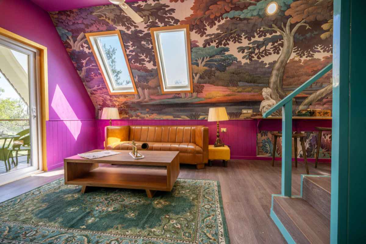
Want drama without chaos? Choose one bold color and keep the rest clean.
Emerald + warm white + gold
- Walls or cabinetry: emerald
- Supporting: warm white
- Accents: gold/brass, natural wood
Stunning in dining rooms, powder rooms, and offices.
Charcoal + white + soft blush
- Walls: charcoal or graphite
- Trim: white
- Accent: blush (art, pillows, rug detail)
Blush softens charcoal and keeps it from feeling cold.
Black (or near-black) + creamy white + natural textures
- Walls: near-black
- Trim: creamy white
- Textures: linen, jute, light wood
Works best with good natural light and a few warm elements.
Tips You Can Apply Today: Make Any Color Scheme Look Cohesive

Here’s a simple checklist that makes a room look “finished” fast:
- Repeat your accent color 2–3 times (pillow, art, vase) instead of using ten different colors once.
- Choose one metal finish per room (or two at most—like brass + black).
- Use a large rug to unify the palette (most rooms need bigger than you think).
- Keep wood tones consistent: mix light + medium or medium + dark rather than all three.
- When in doubt, pick a palette with a 60/30/10 balance:
- 60% main (walls/large pieces)
- 30% supporting (rugs/curtains/furniture)
- 10% accent (decor/art)
Common Mistakes With Room Color Schemes (And How to Fix Them)
Mistake: Choosing paint before the rug or sofa
Fix: If you’re buying anything new, choose the largest textile first (rug or sofa), then pull paint from it.
Mistake: Ignoring undertones in trim and flooring
Fix: Match paint undertones to the “fixed” elements. If your trim is creamy, ultra-bright white walls can look harsh.
Mistake: Using too many competing accents
Fix: Pick one accent family (blues, greens, warm reds, etc.). Keep the rest neutral.
Mistake: Testing one tiny swatch and deciding
Fix: Sample larger—paint a 12x12 inch (30x30 cm) area (or use peel-and-stick samples) and check morning, afternoon, and night.
Mistake: Making everything the same intensity
Fix: Add depth by mixing light + mid-tone + deep within your scheme (even if it’s all “neutral”).
Bring Your Room Color Scheme Together With Final Finishing Touches
The best room color schemes don’t just look good on a screen—they work with your light, your finishes, and your everyday life. Start with one palette that fits the mood you want, then build contrast through textures and a few repeated accents.
If you’re updating multiple rooms, choose one neutral you can reuse for easy flow throughout the home.
— Olivia
More Home Tips 👇🏼👇🏼