
Color and Texture Choices for Neurodiverse Comfort


When designing spaces for neurodiverse individuals, it’s crucial to consider how colors and textures impact sensory experiences.
The environment plays a significant role in how people feel and interact, especially for those with sensory processing differences, such as autism or ADHD.
By understanding the relationship between color, texture, and comfort, we can create spaces that promote relaxation, focus, and emotional well-being. This article explores color and texture choices that can foster comfort for neurodiverse individuals, while also providing practical tips for creating sensory-friendly environments.
Understanding Sensory Sensitivities
Sensory sensitivities are common among neurodiverse individuals. Some people may be overly sensitive to certain textures or colors, while others might seek intense sensory stimulation.
For instance, bright, highly saturated colors or bold patterns can overwhelm some people, while others may find them energizing or stimulating. Similarly, certain textures may feel soothing, while others may be irritating or uncomfortable.
Creating a space that caters to sensory needs involves balancing colors and textures to support calm, focus, and comfort. It is essential to keep in mind that every person is different.
Therefore, experimenting with various approaches and observing how someone responds can help determine the best environment for them.
The Power of Color in Neurodiverse Comfort
Color psychology has long shown how colors can influence mood and behavior. For neurodiverse individuals, color choices are especially important, as certain hues can either soothe or overwhelm. Here’s a breakdown of colors and their potential effects:
Soft Blues and Greens
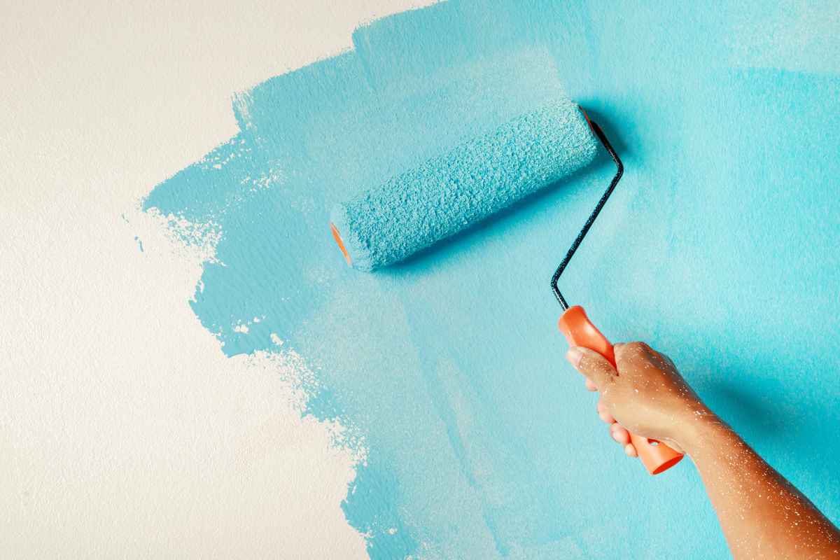
Blues and greens are often recommended for creating a calming, relaxing environment. These colors are associated with nature and tranquility, making them ideal for bedrooms, meditation areas, or quiet spaces. Soft, muted tones of blue can reduce anxiety and help promote sleep, while green can encourage a sense of balance and harmony. These shades are especially useful in environments where stress or overstimulation is a concern.
Gentle Neutrals
Neutral colors like beige, gray, and off-white provide a grounding effect without being overpowering. These colors can create a sense of calm and stability, which is crucial for neurodiverse individuals who might experience sensory overload. Lighter neutrals are ideal for backgrounds, walls, or furniture, allowing other elements of the room to stand out without feeling chaotic.
Warm Tones
Warm colors such as soft oranges, yellows, and warm browns can be energizing, but they must be used carefully. While they can create a cozy, welcoming atmosphere, intense or overly saturated warm hues might be too stimulating for some individuals. A warm, muted palette, such as mustard yellow or terracotta, can strike a balance between warmth and comfort.
Avoiding Overwhelming Colors
Bright, neon, or highly saturated colors should generally be avoided, as they can contribute to overstimulation. These intense colors may be unsettling or distracting for neurodiverse individuals, particularly in spaces meant for relaxation or focus. Instead, opt for softer, more muted tones to maintain a peaceful and calming environment.
The Role of Texture in Creating Comfort
Textures are just as important as colors when it comes to creating a neurodiverse-friendly space. Sensory sensitivities to touch vary greatly, so it’s essential to consider a range of textures that can either soothe or comfort. Below are some textures to consider for different types of sensory needs:
Soothing, Soft Fabrics
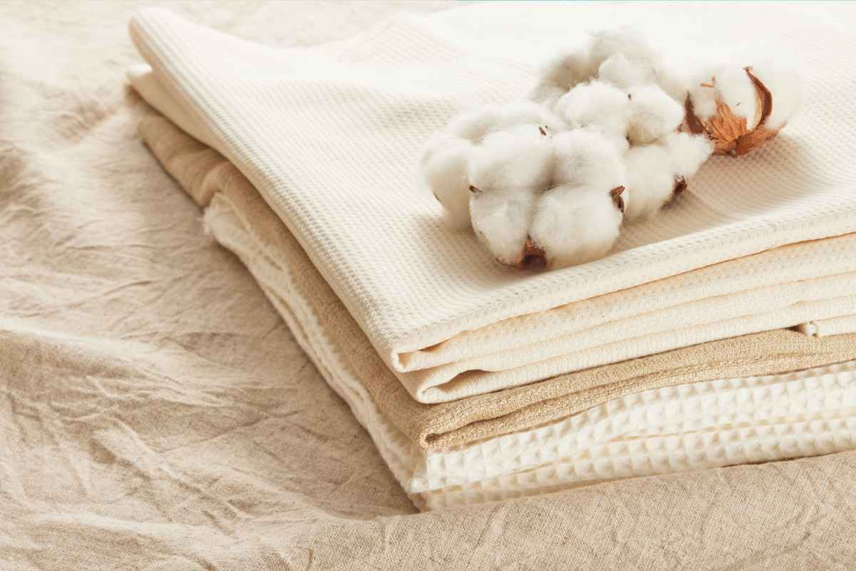
Soft, comfortable fabrics can be a great addition to any neurodiverse-friendly space. Fabrics like cotton, velvet, and wool are gentle on the skin and can create a sense of comfort and warmth.
Soft, plush textures in bedding, pillows, and throws can also provide a tactile sensation that encourages relaxation. These cozy materials can promote a sense of security and calm, particularly in spaces like bedrooms or sensory retreats.
Smooth, Clean Surfaces
Some neurodiverse individuals might prefer smooth, cool surfaces. A smooth table, countertop, or floor can feel more comfortable than rough or uneven textures.
When selecting materials for furniture or flooring, consider smooth options such as polished wood, glass, or polished stone. These materials provide a calming, uninterrupted tactile experience that can be soothing for those sensitive to touch.
Avoiding Scratchy or Uncomfortable Materials
Certain materials, like rough wool or scratchy fabrics, can be irritating for individuals with tactile sensitivities. It's essential to avoid these textures, especially in areas where people might spend time sitting or resting.
Instead, opt for softer options that feel pleasant against the skin, ensuring that the space remains inviting and comfortable.
Textured Surfaces for Stimulation
On the other hand, some individuals may find textured surfaces soothing and stimulating in a positive way. Textured fabrics, like chenille or knitted textiles, can provide a sense of tactile engagement and may be beneficial in certain areas, like playrooms or creative spaces.
Textured elements like woven rugs, quilted throws, or raised wall art can provide just the right amount of sensory stimulation without overwhelming the individual.

Combining Color and Texture for Balanced Sensory Design
When designing spaces for neurodiverse individuals, balancing both color and texture is key. Combining calming colors with soft textures can create a serene environment, while adding subtle touches of texture and color can offer the right amount of sensory stimulation. The key is to find harmony between these elements to support comfort, calm, and focus.
Here are a few tips for integrating color and texture in a balanced, neurodiverse-friendly way:
Layering with Purpose
Layering textures can help provide a sense of comfort and control. For example, start with soft, neutral-colored furniture, and then add textured elements like plush cushions or soft throws. The layering of tactile sensations can offer a gentle sensory experience without overwhelming the individual.
Creating Sensory Zones
Designate specific areas of the space for different sensory needs. For example, a quiet reading nook with soft textures and calming blues, while an interactive play area might feature warmer tones and more textured elements for stimulation. Zoning the space allows individuals to seek comfort or stimulation based on their needs.
Incorporating Natural Elements
Natural materials, like wood, stone, and plants, provide both tactile and visual comfort. Wood grain, stone textures, and the calming green of plants can create a balanced environment that feels connected to nature. These materials can evoke a sense of tranquility, which is ideal for neurodiverse individuals seeking calm.
Designing for Comfort and Well-being
Designing spaces that cater to neurodiverse comfort involves thoughtful consideration of both color and texture. By selecting calming, neutral colors and incorporating soft, soothing textures, we can create environments that promote relaxation and focus.
Understanding sensory needs and choosing elements that align with those preferences can lead to spaces that feel supportive and welcoming.
Whether designing a bedroom, study area, or playroom, the right combination of color and texture can make all the difference in fostering a sense of comfort and well-being for neurodiverse individuals. By focusing on sensory experiences, we can help create environments that promote both emotional and physical comfort.
Did you find this post Useful or Inspiring? Save THIS PIN to your HOME Board on Pinterest!

More Home Tips 👇🏼👇🏼