The 5 Best Paint Colors to Choose for a Bright Front Door

If you’re choosing 5 Paint Colors for Front Door updates this season, you’re in the right place.
This quick guide distills practical, design-forward ideas so you can pick confidently—whether you love a classic blue front door, bold burgundy, or sleek black.
Below you’ll find inspiration, paint tips, and how to pair tones with brick, siding, and hardware for instant curb appeal.
Why Front Door Color Matters
 Your entry sets the tone for your home. The right hue can elevate architecture, boost resale perception, and make everyday arrivals feel special.
From timeless neutrals to fun door colors, the choice should reflect your style and your façade’s undertones.
Before you paint, confirm your substrate and finish. Solid timber? You’ll want a durable exterior wood paint. For metal or fiberglass, choose high-adhesion exterior door paint.
Either way, invest in the best paint for front door you can—coverage, color fidelity, and longevity all improve with quality.
Finally, sample in daylight. Natural light shifts dramatically across porches; swatches that look perfect indoors can skew outside.
That’s why we recommend testing your top picks next to trim and hardware for authentic front door color inspiration.
5 Paint Colors for Front Door: Quick Overview
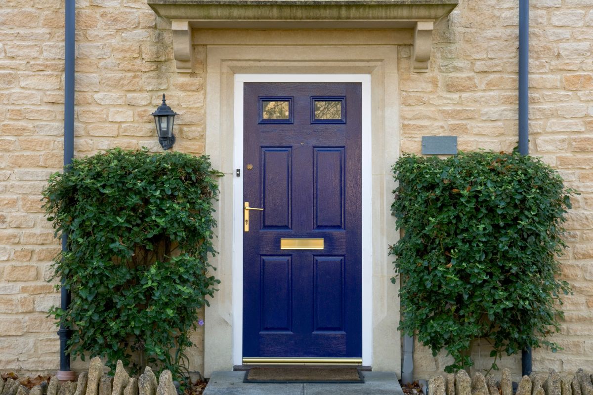
 1) Deep Navy — A sophisticated anchor for coastal, cottage, or modern homes. Navy complements stone and cool siding and instantly modernizes brass or black hardware. It’s often the safest route for a stylish blue front door without going too bright.
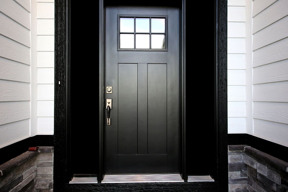
2) Classic Black — Crisp and architectural, black front doors frame the entry like eyeliner. On white or pale façades, the contrast feels clean and upscale. Matte and satin sheens both work; satin tends to be easier to keep tidy.
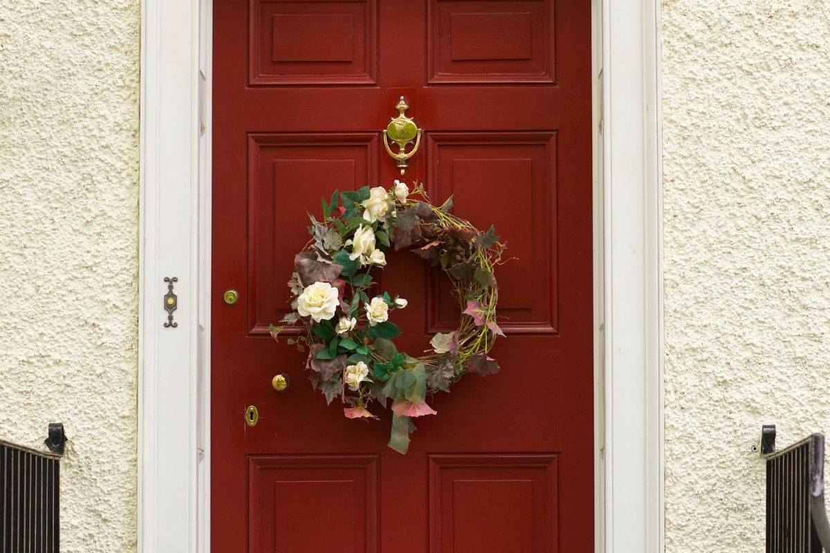
3) Burgundy — If you crave warmth, burgundy radiates welcome. It’s an elegant alternative to fire-engine red and plays beautifully with landscaping. Think of it as a tailored suit for your porch—rich, confident, and versatile.
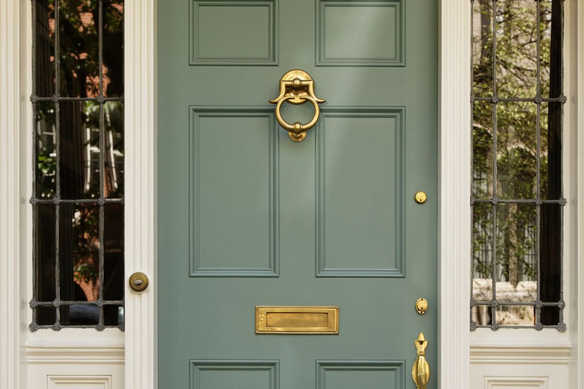
4) Aubergine (Eggplant) — A design-insider favorite. An aubergine door reads mysterious at dusk and luxe at noon, pairing well with aged brass, oil-rubbed bronze, and natural stone.
5) Heritage Red — For historic homes, a rectory red front door nods to tradition without feeling dated. It’s a statement that respects context—ideal for rowhouses and classic colonials.
How to Match Color to Materials
 Brick brings strong undertones—orange, brown, or plum. If you have warm brick, a burgundy red door with brown depth keeps things cohesive.
For cooler brick, try burgundy paint with a touch of blue or even a subtle purple front door red brick pairing if you like moody contrast.
Victorian terraces love character. A victorian front door often shines in saturated heritage shades like deep green, oxblood, or aubergine—colors that highlight stained glass and ornate trim.
On modern façades, lean into simplicity. A navy or black reads graphic and fresh; a softened burgundy adds warmth without clutter. These picks are consistently among the popular front door colors for contemporary streetscapes.
Finish, Formula, and Durability
Great color needs a great carrier. For wood, choose a flexible, UV-resistant exterior wood paint that resists peeling as the door moves with humidity. On composite or metal, look for exterior door paint with excellent adhesion and blocking resistance so gaskets don’t stick.
When shopping, ask for the best front door paint line at your retailer, then compare sheen and washability. Most pros still recommend satin or semi-gloss for enhanced cleanability and subtle glow. In short: prioritize quality over price and you’ll repaint less often.
If you’re new to DIY, choose forgiving formulas designed as paint for front door projects—self-leveling products minimize brush marks and speed up weekend makeovers.
Color Notes & Extra Inspiration
 Still undecided? Collect front door color inspiration from historic districts and design feeds. You’ll notice recurring winners: navy, charcoal, classic red, and aubergine. These families deliver personality with polish.
Prefer playful energy? Explore fun door colors like teal or coral for beachy cottages, or muted plum for urban stoops. Just keep the palette tight—coordinate planters, mats, and lighting so the entry reads intentional.
And if heritage speaks to you, test a refined rectory red front door. With brass knockers and creamy trim, it feels timeless yet inviting.
Acknowledgment & What You’ll Learn in the Video
This article spotlights ideas shown in the referenced YouTube video and adds context for product selection and pairing. The video creator deserves full credit for the visual examples and original curation.
In the clip, you’ll see real-world doors painted in navy, black, burgundy, aubergine, and heritage reds—with notes on hardware, trim contrast, and when to go glossy versus satin.
Watch to discover which tones flatter different façades, how lighting alters perception, and why testing large samples outdoors yields the best results.
We hope you enjoy watching this video about choosing front door colors:

Source: Cityline
Did you find this post useful or inspiring? Save THIS PIN to your HOME Board on Pinterest! 

Once again, thank you for visiting our website!
We hope you've enjoyed exploring the content we've created for you.
Give yourself the chance to learn, get inspired, and have even more fun, keep browsing...
More Home Tips 👇🏼👇🏼